The data analysis tool in Langdock is a Python code interpreter that executes Python code in a secure, stateful Jupyter notebook environment. It enables users to read and process CSV files, Excel or Google Sheets, perform calculations, create visualizations, and generate new files. For spreadsheet preview details in the Library, see Recent Files. You can use the data analysis tool to:Documentation Index
Fetch the complete documentation index at: https://docs.langdock.com/llms.txt
Use this file to discover all available pages before exploring further.
- Read tabular data (CSVs, Excel sheets, and Google Sheets)
- Perform mathematical operations, e.g., finding correlations, defining distributions or deviations, etc.
- Create graphs and charts depicting data
- Generate new files (Excel, CSV, Word, PDF, JSON, text files, etc.)
- Run custom Python code for complex data transformations
Execution environment
The data analysis tool runs Python code in a stateful Jupyter notebook environment. Here’s what you need to know:Available libraries
The environment comes pre-installed with common data science libraries:| Category | Libraries |
|---|---|
| Data manipulation | pandas, numpy |
| Visualization | matplotlib (preferred for charts) |
| Documents | python-docx (Word files), reportlab (PDFs only) |
| General | json, standard Python libraries |
Limitations
- No internet access - External web requests and API calls are disabled
- 60 second timeout - Long-running operations may time out
- Session persistence - Your session state persists between code executions within the same conversation, but files are deleted after 15 minutes of inactivity
How it works
-
The data analyst is a tool the model can choose. It gets triggered when you prompt the model to use it (“use the data analyst”) or when the according file is uploaded (GSheets, CSVs, Excel files). Here is an example of a file we will use in Langdock:
-
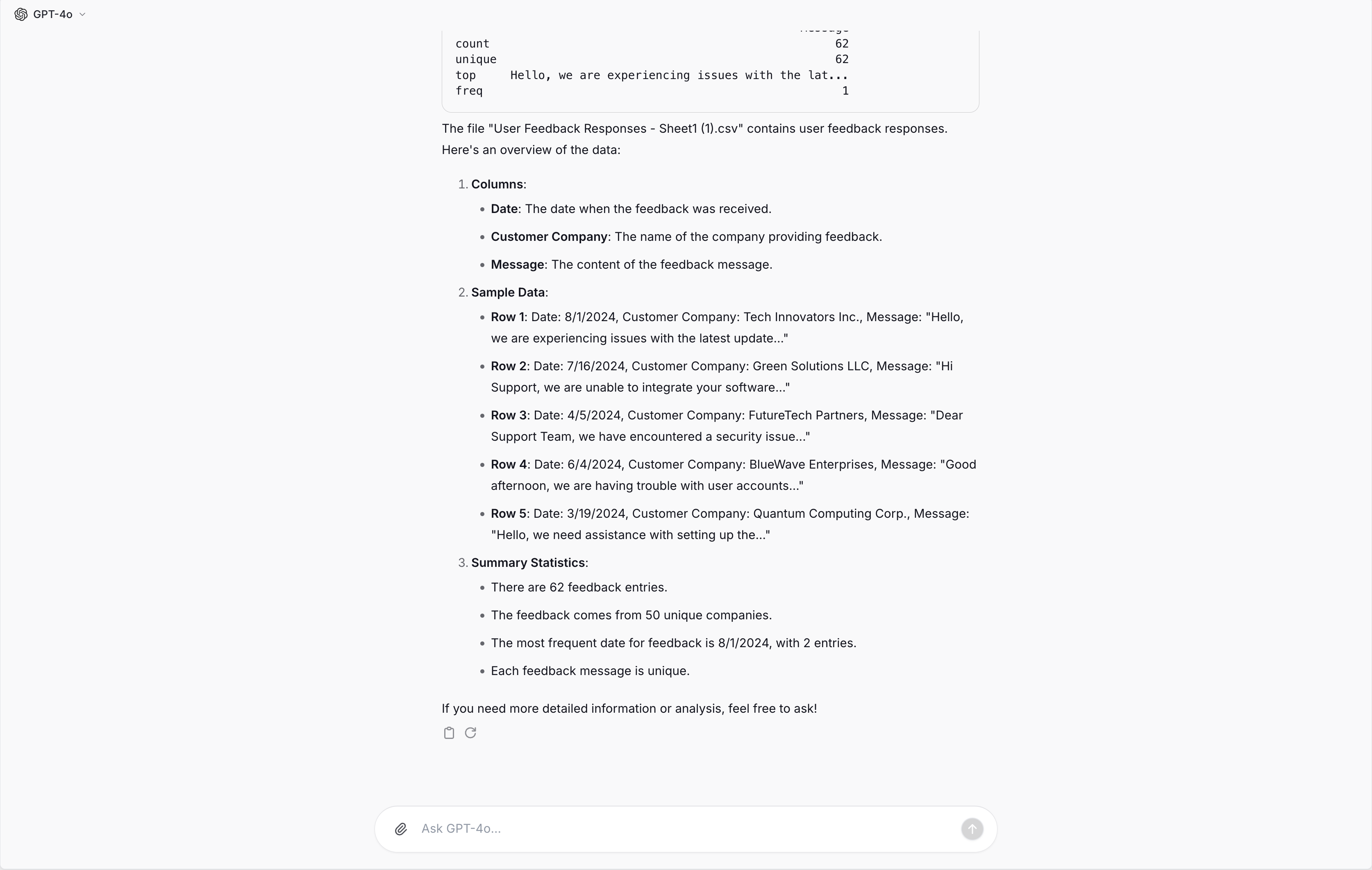
The model then generates Python code. Python is a programming language that can be used to analyze datasets and extract information. In the dark code block at the top you can see the generated Python code to analyze our example file:

- After the code has been generated, a separate instance runs the Python code and returns the result to the model. It is shown under the code block in the screenshot above.
-
The model uses the prompt and the result to answer the user’s question. In our example, this looks like this:
-
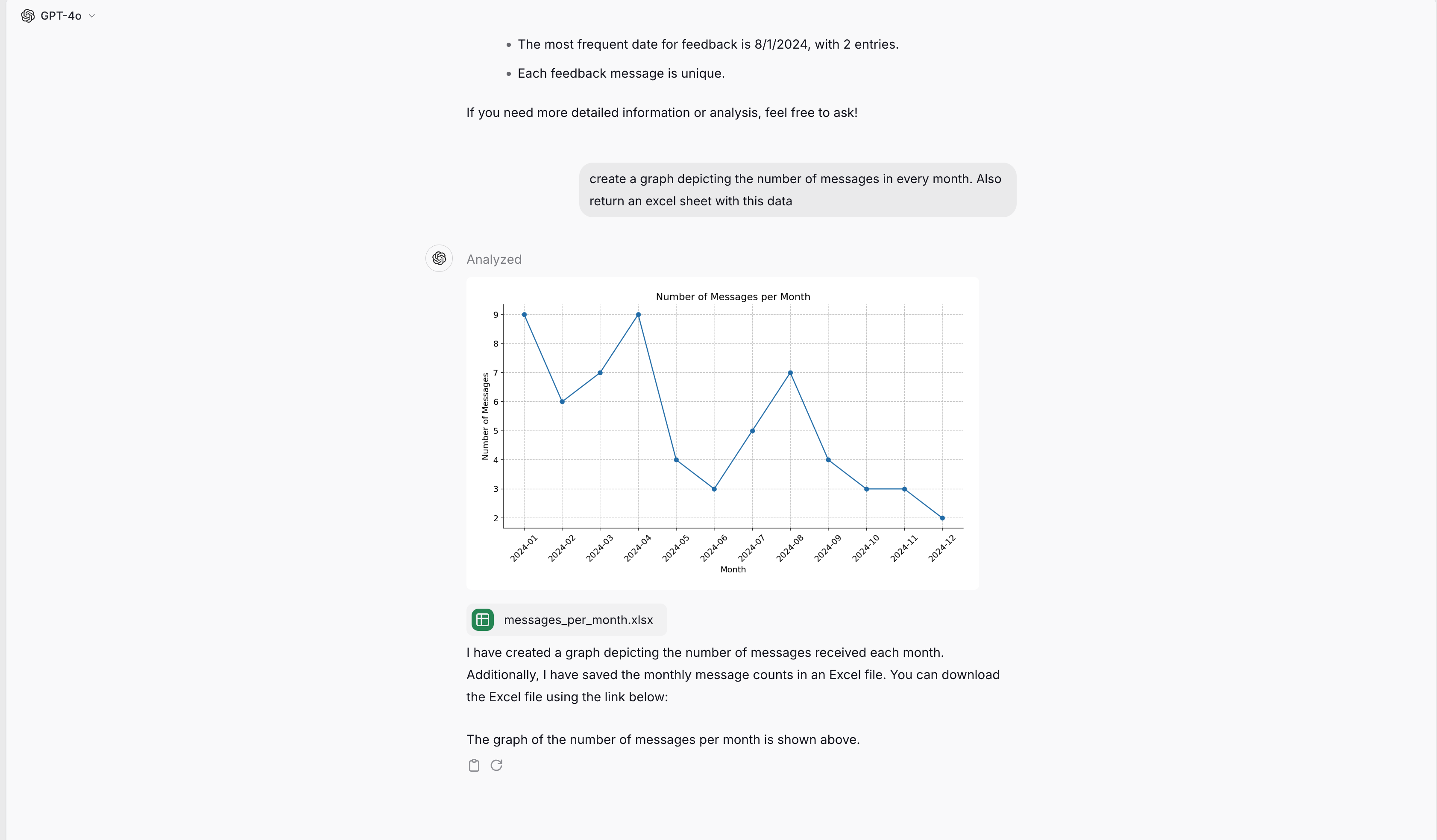
If you request a file or a diagram, the model generates code again to generate the file and executes it afterwards. The generated file or diagram is then displayed in the chat and can be downloaded.
Working with files
Uploading files
When you upload a file (CSV, Excel, or connect a Google Sheet), it becomes available at/mnt/data/filename.ext. The model can then read it using pandas:
Generating files
The data analysis tool can create various file types that automatically become available for download:| File type | How to create |
|---|---|
| CSV | df.to_csv('/mnt/data/output.csv', index=False) |
| Excel | df.to_excel('/mnt/data/output.xlsx', index=False) |
| Word | Use python-docx library |
Use reportlab library only | |
| JSON | json.dump(data, open('/mnt/data/data.json', 'w')) |
| Images | plt.savefig('/mnt/data/chart.png') or display directly |
/mnt/data/ automatically appear as downloadable attachments above the message. You don’t need to ask for a download link.
Spaces in filenames are automatically converted to underscores for compatibility. For example,
My Report.docx becomes My_Report.docx.Output formats
The data analysis tool supports several output formats:- Text output - Printed results, summaries, and calculations appear directly in the response
- Tables - DataFrames are displayed as formatted tables
- Charts and visualizations - Images are displayed inline and can be downloaded
- Generated files - Documents, spreadsheets, and other files appear as downloadable attachments
Charts
Langdock offers two ways to create visualizations: built-in charts for simple data and matplotlib for complex visualizations.Built-in charts
For straightforward visualizations, the model uses a native chart tool that renders directly in the chat interface. These charts are fast, interactive, and don’t require code execution. Supported chart types:| Chart type | Best for |
|---|---|
| Bar | Comparing categories, showing distributions |
| Line | Trends over time, continuous data |
| Pie | Showing proportions of a whole |
- “Show me a bar chart of sales by region”
- “Create a pie chart of the budget breakdown”
- “Plot the monthly revenue as a line chart”
When matplotlib is used instead
For more complex visualizations, the model uses matplotlib through the Python code interpreter. This happens when you need:- Multiple data series or subplots
- Custom styling, colors, or annotations
- Statistical visualizations (histograms, scatter plots, heatmaps)
- Advanced formatting or layouts
- “Create a scatter plot with a regression line”
- “Show a heatmap of the correlation matrix”
- “Make a histogram of the age distribution with 20 bins”
- “Plot sales and costs on the same chart with different y-axes”
Differences to other documents
The normal document search and the data analyst are different functionalities for different tasks with advantages and disadvantages. The document search is good at understanding a whole document content. It is not good at processing tabular data. The data analyst can not understand the entire file, but only the part that is extracted with Python. Everything else in the file has not been considered for the response. But this makes it powerful in working with large data sets and tabular data, as well as performing mathematical operations.Best practices and troubleshooting
- In order to parse the file correctly, all column titles should have a descriptive name. When referring to the column name, ideally use the full column title and not “Column K”. This is relevant as the AI model creates Python code which can only reference the correct column if the name is the same. Giving the same column name reduces the risk of letting the model generate code that references an incorrect column.
- Make sure to enable the data analysis functionality in your settings and (if you are using a sheet in an agent) also in the capabilities section at the bottom of the agent editor.
- Try to describe what you expect as precisely as possible. You can use the prompt elements from our prompt engineering guide (especially task, context, response format)
- If possible, avoid empty cells in a sheet.
- When you expect complex operations and receive no result or incorrect results, try to break the instruction into different prompts.